The Process
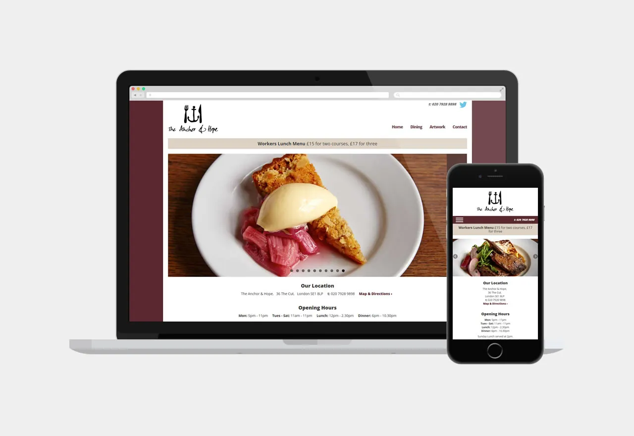
The websites are fully responsive, working seamlessly across various devices, from smartphones to desktop computers. After analysing the website analytics for fellow client Le Café Anglais, where mobile usage exceeded 20%, we recognised the importance of a responsive design.
This insight guided critical decisions regarding the user interface. Given the high likelihood of users accessing the site through smartphones, we aimed to minimise the need for multiple page navigation to reach essential information like contact details and opening hours.
In light of this, we strategically placed opening times and contact details on the homepage. Additionally, the contact telephone number is prominently displayed in the header throughout the site, ensuring easy accessibility.
It was agreed that the homepage should have a strong visual impact by utilising the greatest asset of all three venues: their food. With that in mind, the photographer Patricia Niven was commissioned to photograph some of the wonderful menu items to appear on a homepage image scroller.
Staff are able to update daily menus using the content management system by simply copying and pasting the text from the Word documents they use to print menus in-house.


