• Web design
  • Web development
  • Logo design

Web design and build as well as branding for Whitney Murray, who appoints executive-level Corporate Affairs, Investor Relations and Communications professionals to the world’s leading companies, PR consultancies and third-sector organisations.

Whitney Murray logo

Logo design

The client was open to ideas about the form of the logo, but expressed a preference for a blue and pink colour scheme.

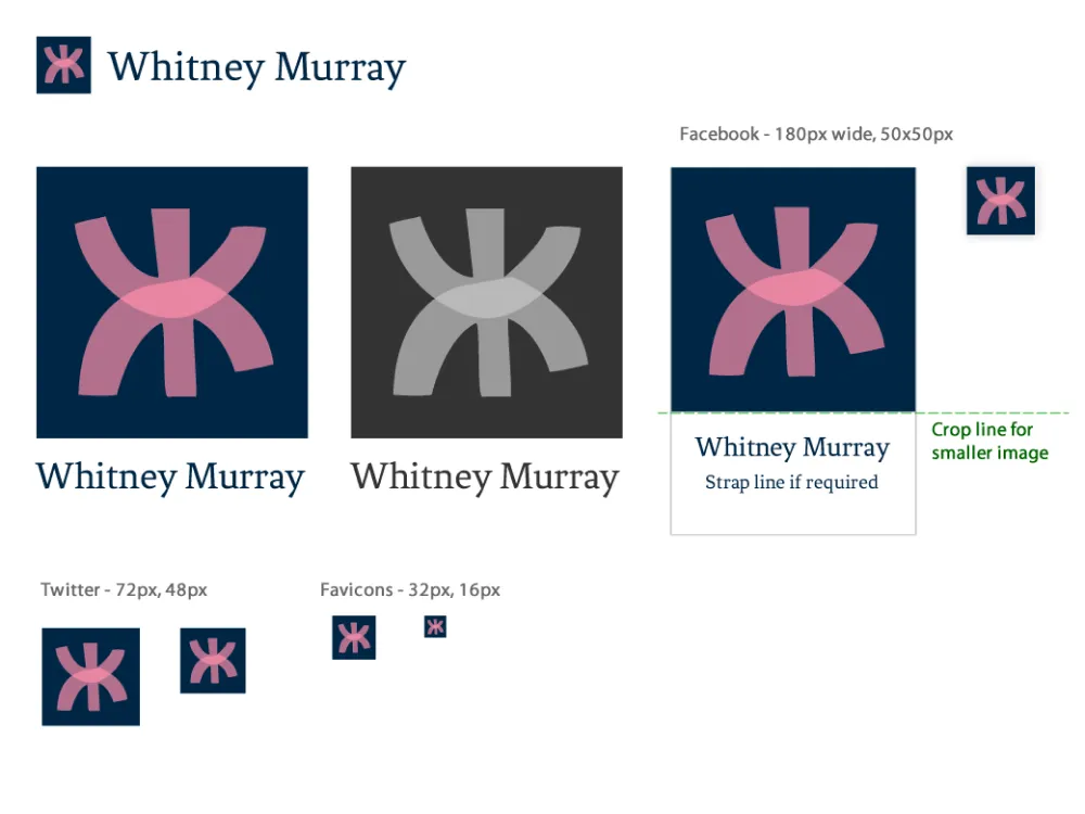
Initial Design Concept

The initial inspiration for the logo came from the sculptor Eduardo Chillida. It featured abstracted forms of the company initials alongside the name in the Fenix typeface.

The name Whitney Murray is derived from the company MD Rebecca Whitney, who used her maiden and married surnames. To reflect their relationship, I opted for a transparent overlay where the initials overlap. The client was initially enthusiastic about this design but felt it lacked seriousness and was perhaps too unconventional for their field.

Whitney Murray baranding iteration

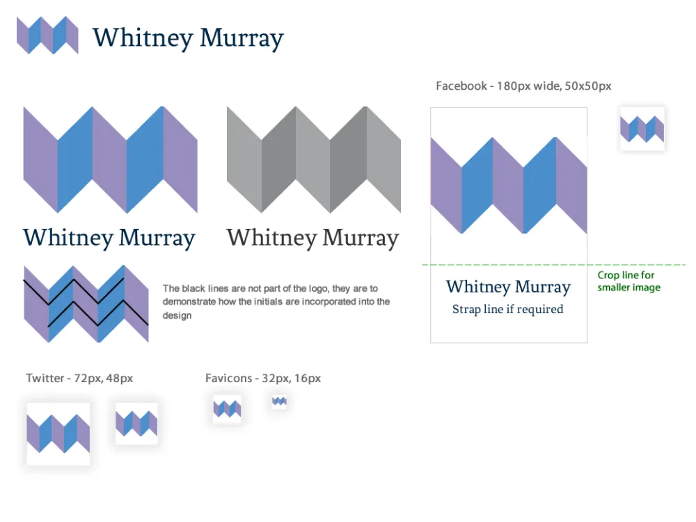
Second iteration

Following client feedback, I created a new design. While they liked the colours of the initial design, they wanted to see a variation of the blue and pink for comparison. The new logo is angular and designed to convey more authority than the initial design.

Whitney Murray baranding iteration

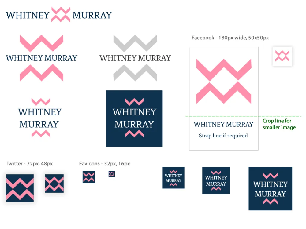
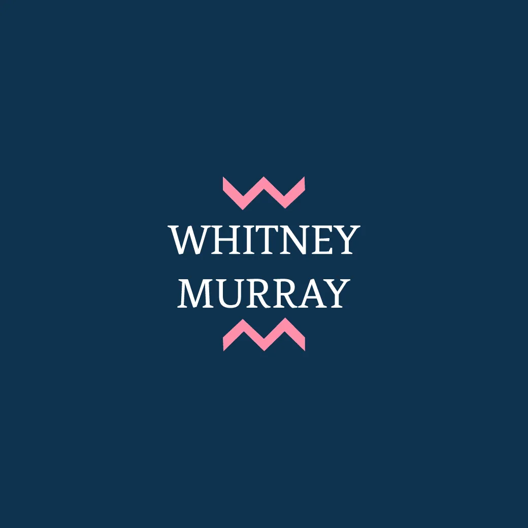
Final logo desgin

The client wanted a design that blended the first and second designs. We reverted to the original colours and vertically aligned initials from the original logo, combining them with the more angular forms of the second design. I also suggested using uppercase font in this configuration, which the client agreed to.

Whitney Murray baranding iteration